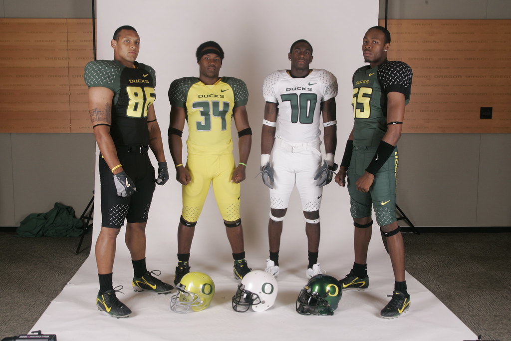
I still don't understand how out of four uniforms and three different helmets, they still couldn't come up with even one item that didn't look completely retarded.
maybe it's just me and my generation but i think these are pretty bad ass. The VT coach said last year about the new nike uniforms that the recruits seem to like them and if it helps they'll wear emm. I guess it is my generation.
I'm no Mr. Blackwell, my gawd dem's ugly. The trifecta would have been the mismatched sleeves like UF and VT "rocked" last year.
The real victims are the bald, fat, middle-aged white guys who are going to look ten times more reatrded than usual wearing those to games, social events, casual fridays in Eugene, and even around the house. Won't someone think of these men's wives, children, and families?
Not so fast...don't misrepresent the younger generation. I'm only 24 and I think these things look hideous. DIAMOND PLATING design on uniforms? Uhhh, no.
I believe the 1st time they busted those green things out was against Oregon State. God gave his opinion the next week: http://news.bbc.co.uk/2/hi/americas/4458218.stm
Agree with IB. I'm 23, and those are still god-awful. Hideous. So unless the one anonymous kid is like 5 or something, he's still in the minority liking that junk.
Ridiculous... screw Nike and their golf clubs, bats, and horrible horrible uniforms. Even our baseball uni's were lamer this year with all that color in the armpit area.
Just wait Dawgs, I'm thinkin within the next 5 years we'll have some kind of "slick new" futuristic stripes and re-done numbers too! *fingers crossed*
A large part of the University and athletic department is financed by Nike.
ReplyDeleteWhat Nike wants, Nike gets.
Yeah, if Phil Knight wanted Mike Belote to come out in a pink tutu, he'd darn well do it. Pathetic.
ReplyDeleteI still don't understand how out of four uniforms and three different helmets, they still couldn't come up with even one item that didn't look completely retarded.
ReplyDeleteThose duds look like they could play some football and, if not they could whop butt.
ReplyDeletemaybe it's just me and my generation but i think these are pretty bad ass. The VT coach said last year about the new nike uniforms that the recruits seem to like them and if it helps they'll wear emm. I guess it is my generation.
ReplyDeleteI'm no Mr. Blackwell, my gawd dem's ugly. The trifecta would have been the mismatched sleeves like UF and VT "rocked" last year.
ReplyDeleteThe real victims are the bald, fat, middle-aged white guys who are going to look ten times more reatrded than usual wearing those to games, social events, casual fridays in Eugene, and even around the house. Won't someone think of these men's wives, children, and families?
Not so fast...don't misrepresent the younger generation. I'm only 24 and I think these things look hideous. DIAMOND PLATING design on uniforms? Uhhh, no.
ReplyDeleteI think the white helmet with the green O looks pretty sweet.
ReplyDeleteLooks like Phil Knight got into the Humboldt again...
ReplyDeleteThe fighting highlighters strike again.
ReplyDeleteEven the number font sucks. Plus, why would you want your uniform to look like you just got run over by a car?
ReplyDeleteI believe the 1st time they busted those green things out was against Oregon State. God gave his opinion the next week: http://news.bbc.co.uk/2/hi/americas/4458218.stm
ReplyDeleteAgree with IB. I'm 23, and those are still god-awful. Hideous. So unless the one anonymous kid is like 5 or something, he's still in the minority liking that junk.
ReplyDeleteRidiculous... screw Nike and their golf clubs, bats, and horrible horrible uniforms. Even our baseball uni's were lamer this year with all that color in the armpit area.
Just wait Dawgs, I'm thinkin within the next 5 years we'll have some kind of "slick new" futuristic stripes and re-done numbers too! *fingers crossed*
I can take the uniforms the away's are really cool but that nasty neon yellow helmet sucks major balls
ReplyDeletethe players get to design their own uni's n the white helmets have white ghost flames on them...its friggin sweet
ReplyDeleteThese uni's are tight. Get cha mind right, if you dont think these are tight.
ReplyDeleteGO BIG BLUE