


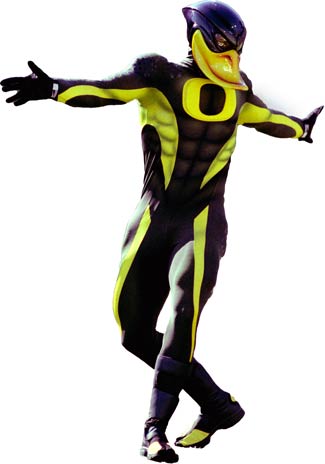
According to Oregon, these unis were not just thrown together by some Nike intern tripping on acid and chronic. No, they were the result of a two year(!) collaborative process involving Nike bigwigs and current & former Oregon players. According to Oregon, "the advanced design and technology of the uniforms will help to diminish the weight of the uniforms by 28 percent when dry and help make them 34 percent lighter under wet condiditions. The jerseys and pants also encompass a diamond-patterned grid on the shoulders and knees, respectively, to improve the durability of the product in areas susceptible to greater wear."
Improve the durability of the product in areas susceptible to greater wear? Oh, horseshit. First, when was the last time you saw your team's football uniform wear out? Second, Phil Knight is an Oregon alum, and I think he would pony up for new pants if they get threadbare during the season. Third, Oregon basically has a pair of pants per game, so I would hope the "advanced design and technology" could last four hours. Just 'fess and admit it: you think faux steel-plating looks cool!
Still, you ask yourself: what the hell were they thinking?? A simple math problem may provide insight.
PLUS
EQUALS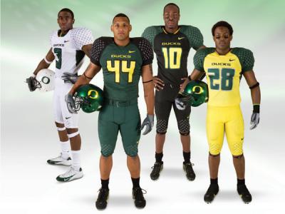
This is the answer to the not-so-hypothetical question 'how hard do you have to try to be the state's primary punchline when your in-state rival is the Beavers?'
Dawnoxious,
Senior Correspondent
Beaver Jokes Division
HT: MZone

5 comments:
The color schemes and numerals are atrocious, but it's the faux-steel plating on the shoulders and knees that really push them over the top in terms of Teh Ghey. The overall effect is sort of like if someone from the late '70s or early '80s had written a movie about a football league set in the 21st century and the producers and/or costume designers had to envision what uniforms would look like in the future. Now, go back and watch some of those '70s/'80s sci-fi movies like "Rollerball" and "Death Race 2000" and ask yourself, is there anything about them that you'd want to emulate in modern society?
Agreed, Doug. Reminiscent of the gear Casper Van Dien sported while playing arena football/gymnastics in Starship Troopers. Just in uglier colorways.
This is just one more reason why people from the Southeast have such a hard time taking football from the Northwest seriously. First the Boise State slaughter and now this.
They actually wore these twice last year that I remember seeing. Hideous.
The font on the numbers is very funny though - straight up Atari 2600, Combat or Pitfall or whatver you like.
Kanu: I tried unsuccessfully to find a link, but I could swear I read the Nike copyrighted the font as "Belotti Bold" or something like that.
Post a Comment